Infographics are becoming very popular and can be used to display many different types of information. Some are even interactive! Visual.ly is a website that has over 12,000 infographics and data visualizations that you can browse or search by topic, such as "science" or "education." It's worth a look!
These visualizations can be very helpful in trying to explain difficult concepts to students. Right now, it is very difficult to create an infographic yourself because you need graphic design or coding skills. Luckily, sites like Visual.ly are in the process of creating tools that will let anyone make their own. It's not ready yet, but we should be able to design our own graphics soon.
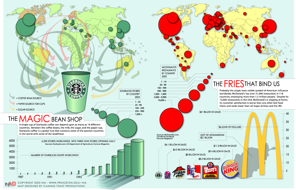
My 5 Favorite Infographics:
(Click on any of these to zoom in.)
1. The Designer's Toolkit
This summarizes the tools and apps that creative and design professionals currently use the most. Looking at the graphic, you can see that some of the most popular tools being used are things that many of us are already using (Google Docs, Dropbox, Evernote, and Gmail)!

2. Class in Session: Learning Tools Over the Years

3. The Growth of Social Media

4. Visualizing Density

5. Renewable Energy

No comments:
Post a Comment